MATTHEW VELEZ
I graduated from my Bachelor of Fine Arts, Design at YSDN in Toronto in 2016. Since then, I've been working as a designer for clients across Canada.
In 2019, I founded Untitled Design Studio with my partner, offering strategy and design services.
Today, I live in Montreal with my partner, where I've moved my complete attention to a career in Game Development. I've been learning and exploring game design & 3D art, participating in Game Jams, and more.
In my free time I practice creative writing, music production, apparel & graphic design, UI, 3D & 2D art and programming.
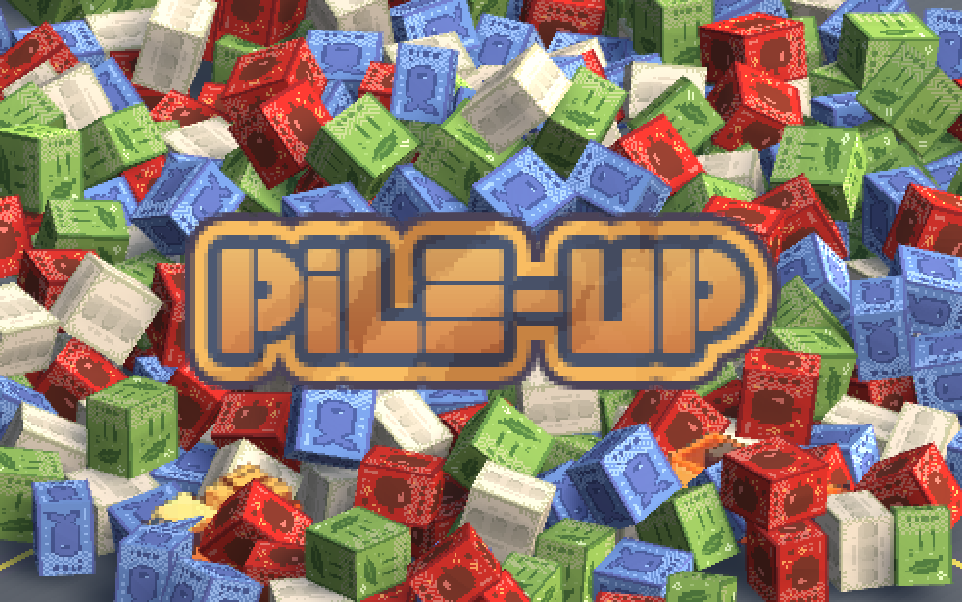
PROJECT BRIEF
This was a Ludum Dare Game Jam entry. The theme of the jam was: Delivery.
CONCEPT & THEME
A game about packing trucks! We wanted to make something quick & compulsive.
ROLES
- Game Designer
- Programmer
- Additional Art
Design Goals
- Compulsive & Rewarding
- Quick Sessions
- Infinitely Playable/Dynamically Challenging
Instructions
Drag and drop the corresponding crate in it's truck!
Debrief & Challenges
- Tiny Timeline
- Highly Accessible/Simple Control Scheme
- Needs to Stand Out!
Pile Up was designed to be a compulsive match-4 where players have to sort packages into their corresponding delivery truck. Players are awarded 100 points on matching crates with trucks. On mismatches or expired boxes, players lose time. At 4 positive matches, players receive a bonus 1000 points and time, the full truck leaves, and a new truck drives in. This is where the tension of the game comes from - the player is relatively quick and can match objects easily. If there was a wrong match, it would most likely be from an input error rather than confusion. By design, this balance and reward structure allows a skilled player to play the game in perpetuity, raking in time with fullloads. But this quick-fire, constant matching means when they're receiving packages for trucks they can't match, they're eagerly waiting, painfully even, for a matching color to finish a combo and get a new truck to clear their stack of packages and keep the timer going. By keeping the pace high, and making players beg for the right crate, players would be clearing trucks quicker and quicker, and eventually get to a point where they start making errors.
Outcomes
- Scope Was Still Too Big!
- Everything Takes Longer Than You Think!
- Needs to Stand Out!
While I continue to revisit Pile Up, in order to bring it to a full 1.0 release, this version is a fair approximation of my intent for it. The game is relatively compulsive, and some SFX exist to give a bit of the ~sparkle~ that makes a game like this fun and pavlovian-inly rewarding. In its current iteration, there is still a ton of feedback required to make it truly the brain-pleasing experience of our favorite arcade games, and additional mechanics/balance changes are needed to keep it feeling fair and challenging for highly skilled players. The dedicated player will quickly reach a challenge plateau where the game will stop being challenging and therefore engaging, and the meta-game may still need some exposing for the new player to learn.
LEARNINGS
- Done is better than broken.
- Define what's needed LONG before production.
- Feel is as critical as playable.
Perhaps the largest lessons I learned from this game is to do with Balance and Fun. Particularly, the difference FX makes to enjoyment and when/where/how balance needs to be adjusted. The first 'complete' version of the game simply wasn't fun, due to lack of FX and too clean a balance. Rewards were too frequent, and penalties too mild, considering how much control the player has. By turning minor rewards into sound effects instead of game time, and tying game time rewards only to larger successes (full loads), the game became much more rewarding, and the meta started to reveal itself (it's about loads, not just matches). By making penalties more punishing in time and adding elements the player can't control, like trucks leaving on their own (a mechanic never originally intended), a new layer of tension (and meta-game) was added. A dual-edge emerges, where the player can try and predict truck dispatches at risk of expiring crates. A bad prediction can mean 5 or more seconds taken off the clock from expired crates, but a good prediction can mean 5 or more seconds added for free by a pre-loaded stack of crates. These changes allowed more momentum and swings from success to failure to be more dramatic, making the game more emotionally gripping.
PROJECT BRIEF
This was a Unity Global Game Jam entry. The theme of the jam was: Roots.
CONCEPT & THEME
A game about making roots! Like Pile Up!, game jam games are best when they're quick & compulsive.
ROLES
- Game Designer
- Art
- Music
Design Goals
- Easy to Replay
- Easy to Understand
- Micro-SCOPE-ic (theme emerges!)

**NOTES**
This was my first game in a game engine!The system we used to generate droplets is unoptimized and means the game loads very slowly. Please be patient!
Watch your ears! The music is a bit loud 🥶
Challenges
- What's the best system to achieve the desired feel?
- What's the desired feel? Chill, anxious?
- Balancing your goals vs your teammate vs the various constraints in game dev
Outcomes
- The systems we settled on lead to must-lose situations & pointless clicking
- We managed to finish the game, but were unable to optimize art, music and systems
- The camera was disorienting for some people
LEARNINGS
- Prototype quick to find problems early!
- Don't sit on your hands. Keep talking and making, even if it's not your strong suit - it has to get done!
- What feels right to you may not feel right to your players. (PLAYTEST MORE!)
CONCEPT & THEME
This map started more with feeling than features. I wanted a classic Halo map with lots of scale, space, & vehicles, that had the ancient ruins vibe.
Design Goals
- Make players feel like they're in a classic Halo map
- Give vehicles some of the spotlight
- Make something big but intimate

Challenges
- Flat maps with space for vehicles makes it really hard to hide spawns
- Balancing areas for vehicles and on-foot players
- Make a layout that encourages tactics, strategy and teamplay
Outcomes
- Sometimes a jump isn't enough to make a warthog ride interesting. Same goes if the track is a loop around the perimeter of the map.
- Have yet to find a good balance between a flat space for all the different ways of moving and giving players places to spawn that doesn't leave them exposed
- A few pillars does not an intimate fight make
LEARNINGS
- A little change, like moving the vehicle route in from the perimeter easily makes the adventure more fun by increasing the chance of impacts, accidents, and by adding scenery outside of it
- Under-Designed spaces are sometimes the most fun - as players get a surefire way to find action, like the corridor in the center of the map facilitating shootouts, and quick flag caps
- Your original vision is not always right - the lack of features at each base makes them easy to camp and for skilled teams to dominate
CONCEPT & THEME
This map started when imagining a location that forced players to take advantage of cover and make calculated risks to cross the map.
Design Goals
- Make a highly tactical map that encourages serious team play
- Use bridges and doorways as cover or a lack thereof
- Make

Challenges
- The weapon sandbox of Halo Infinite highly favours range, making a highly exposed bridge challenging to balance
- Too many or too little locations due to symmetry
Outcomes
- VFX on the bridge means players are exposed, but harder to target
- More detailed bases means players are forced to take the action close quarters
- Players tend to pass up the rockets just because of how out of the way it is
Learnings
- One area can serve multiple purposes - cover, and vantage point, bridge and fortress, secret and trap
- Symmetrical maps can halve the work, but complicate 3rd, 4th, or 5th locations by forcing mirrored entrances, layouts, etc.
- Sometimes highly valuable resources aren’t all that valuable - they can’t just be available, they need to be quickly actionable for a player to justify grabbing them
CONCEPT & THEME
Originally conceived as a small cylinder map where players would be facing each other early, the design developed into 2 main levels, with interstitial levels from supports, bridges, stairwells, and central locations. The theme eventually settled on a mysterious reactor or generator room with scripted elements in the centre.
Design Goals
- Create interesting engagements with verticality, proximity, risk & reward, enabling daring acrobatics and memorable moments
- Introduce interactive elements, adding a level of mastery and unpredictability
- Keep players in the action with the constraint of the maps cylindrical and inward facing design

Challenges
- Finding ways to give players adequate cover, especially when spawning
- Finding the right balance of weapon types
- Keep players always in the action with the constraint of the maps circular shape
Considertaions
- Having such a claustrophobic map means players are constantly in each others faces
- Generally players higher up have the advantage over players down below
CONCEPT & THEME
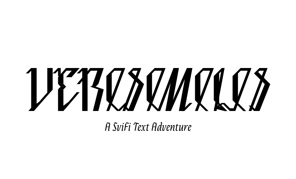
About 8 or 9 years ago, I was contributing to a Zine a friend in design school had started. we're both very much into dystopian/cyberpunk fiction and theory, and the magazine was meant to cover topics related, as well as the 'internet' culture that we were fully immersed in and a part of. I've always been a writer, and one of my contributions was a short story I called "Verisimilis". This short story was intended to be a first chapter of a larger story, but I was never able to really get to the next chapter, until I began to think of it as interactive. Once I had reframed the story as a game, the opportunities began unfolding before me. Verisimilis quickly became the first area of a prototype I wanted to develop. I then went to Inkle to make it interactive and start experimenting with the new world that had emerged.
Design Goals
- Make the world engaging despite having limited forms of interaction
- Reward those who want to get to the point and those who like to explore
- Give the player the agency they deserve, while making sure they arrive where I need them
Challenges
- The only form of interactivity is textual. This means I need to depend on inference, memorization, multiple choice selection, rather than motor skill, to provide "fun"
- Giving users detailed description while not giving them too much to read
- Getting users engaged with text so that they keep clicking - you must leverage every technique - suspense, humor, mystery, etc.
CONCEPT & THEME
"RECEIVER" is a concept shooter I've been developing a prototype for in my spare time. While I have many years experience in UI and design, I don't have much in programming. So when I find myself stumped in Unity, I turn to other areas to offload my ideas. The RECEIVER UI, much like the Halo UI's before it, are designed to simplify the user experience while also affording them flexibility. A key feature of RECEIVER is the ability to switch between a live practice mode and the main menu at any given time. Using a tab/folder layout, and a switcher concept, the menu allows players to always be in the core game experience while searching for games, practicing, customizing or socializing. This prototype was designed to better understand the organization and animation of the menu, and to test the new concepts I was playing with.

Design Goals
- Make something useful, flexible and simple
- Make something unique but intuitive
- Enable players to always be one button from the action
Challenges
- Supporting many features without bloating or over complicating the UI
- Making the UI comprehensible and 'new' at the same time
- Without testing, we can't know exactly what it is players will find useful
CONCEPT & THEME
Halo Infinite is my favorite game so I spent a lot of time intimately interacting with it's UI and so it's limitations became apparent to me quickly. Not to mention Halo once held a very high position in the world of video game UI, even setting the standard for how console games would work from then on with Halo 2. For that reason, I decided to take a crack at, in order to practice the balancing act of having a lot features - many of which that interact with each other.

Design Goals
- Make screens more useful and more distinct to give them importance
- Make a more comprehensible layout that supports inter-functionality
- Make it more beautiful in a way only Halo can embody
Challenges
- Organizing all the different features while not hiding them
- Making a connected home for users to enable social functionality
- Bringing importance to different features while also making them equal
CONCEPT & THEME
The Xbox Home Screen has been a controversial topic amongst gamers since it's first iteration. And while I've always been fine to let sleeping dogs lie - I couldn't help myself this time. I wanted to create something that was more focused on what consoles are good for - playing games and connecting you to other players. All while respecting and highlighting the importance of the TV screen.

Design Goals
- Make getting to your games easier
- Give you the most important information at a glance
- Get out of the way!
Challenges
- Getting out of the way, but also showing enough
- Scaling for accessibility vs aesthetic
- Not saying no the user
CONCEPT & THEME
In 2015(!!), I designed this interface in order to deliver a more engaging and responsive watching experience. I imagined an interface that used gestures for navigation and hidden tags/keywords as the content delivery. Users would be able to swipe their screen in any direction to reveal another video (hypothetically, from their youtube suggestions), and upon releasing, the video would start to play. With a pinch or an expand gesture, they'd be able to see the primary elements of that video, i.e. the Keywords it was tagged with or the suggestions Youtube would make to go with it. This way, users would not have to type to keep watching. They could follow their interests deep down the rabbit hole, finding more of what they like. The concept tries to leverage a 3D spatial environment, hypothetically granting an instinctual understanding of where they were at any given time. Looking back today, who would have thought, that the way to displace Youtube was with a SINGLE gesture(a swipe up or down)? Ah, Tiktok, you magical beast.

Design Goals
- Make searching and navigating videos natural and intuitive
- Give you more of what you want with a simple gesture
- Make the app invisible
Challenges
- The screen was still horizontal, which meant it was still uncomfortable to use on a phone.
- When things are easier to explore, are they easier to get lost in, too?
- No opportunity to test - this was purely an exercise of design without research or prototyping